I’ve been in a bit of a blogging and reading slump lately, and I started to think about a post I could write that would just feel plain fun. I landed on covers because I am one of those people who unabashedly judges a book by its cover, and I find it so fascinating how people are drawn to different aspects of a book cover and how my tastes vary drastically with some other bloggers’.
So, what draws me to a book cover? I decided to analyze some of my recent favorites and came up with a few categories:
- Illustrated Covers!
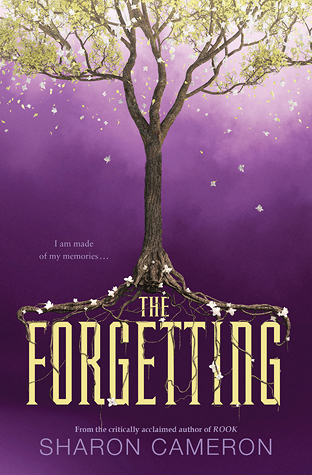
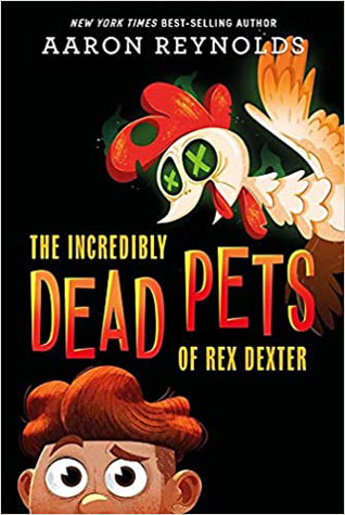
I actually came back up to the top and added this after I was done with the rest of the post because I realized that every single cover that caught my eye for this post was illustrated. Which isn’t to say that I don’t like covers that aren’t illustrated, but it’s not that often that one really wows me.
- Vivid Colors
I absolutely love vivid colors and lots of contrast. Just feast your eyes on the cover for Song for a Whale—pure colorful gorgeousness!!! The colors in these other covers really pop as well!


- A Bit of Drama
There is so much I love about these covers. Take The Elephant’s Girl, for instance: The storm cloud, the arresting and quirky font, the windswept hair and the way the girl is being cradled by an elephant. So many dramatic elements that come together beautifully! And looking at these other covers, you can just feel the drama!


- Surprising/Interesting Elements
Just take a look at the amazing cover for The Beast Player. This cover has lots of drama, but the best thing about it is that you don’t notice at first that the MC is actually standing on a beast! The other covers I’m featuring also have interesting or surprising elements that draw the eye.


- Diversity
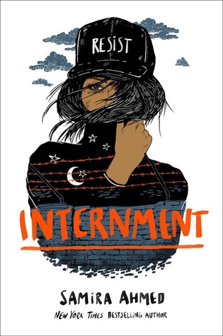
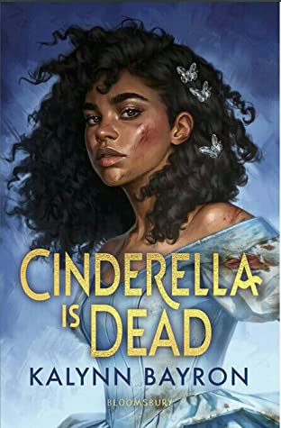
I definitely find myself drawn to books with POC characters on the covers. I chose to highlight the UK cover of Cinderella Is Dead because, even though I love the US cover too, the UK cover also has added drama!


One thing I like less on covers:
- Typography Only/Minimalistic – If the cover is only the title with not much else to it, I’m generally not a fan (though there have been exceptions). Likewise, illustrated covers that just show small random objects don’t usually get me excited.
I’m sure there are plenty of other elements that attract me to a cover (or turn me away), but those are the ones that came to mind when glancing through Goodreads. I thought it was fun to analyze this!


I LOVE this post! I too judge books by their covers. I can’t help it! I’ve tried to stop, but I can’t haha! One thing I DO NOT like on covers is people. I may be the only person, but I can’t stand people on the covers! But I will make an exception. If it’s like a chick lit book with cartoonish people, I don’t mind that. So I understand your like for illustrations. But those covers with the sexy guy/girl/couple or just plain people in general BOTHERS ME! It’s a weird pet peeve I have. My favorite covers are just bold colors with the title in big font and some type of textured background. I’m weird, I know…
I hear a lot of people say they don’t like people on the cover because it ruins their ability to imagine the character for themselves.
Lots of color definitely catches my eye, and yes, I do like a good illustrated cover. However, I have also been drawn to covers with great photos. I had a whole discussion with my daughter about the pros and cons of people on the covers, but part of me likes to have that base image to work with. I would say the synopsis has to do some heavy lifting, when there are little to no images on the cover. I guess a good font is a good font, but it’s not enough for me
I agree that I sometimes like to have people on the covers to have something to go off of.
I agree with a lot of your opinions! Illustrated covers are the best. I also love when a cover has some sort of cool physical element on it, like gold foil or spray painted pages. I guess this more counts for the physical copy of the book, but those are some little details I can appreciate.
If a book has a POC on the cover, it always catches my eye, because there is definitely a lack of representation there. Someone just recommended Cinderella is Dead to me and I now I really want it!
Oh, yes, physical features on a cover are awesome! My mom especially loves covers that have that soft matte finish.
This was such a fun post! I’m also such a sucker for illustrated covers! There’s something about them that just draws me in! But this goes with fonts for me as well. I don’t mind a minimalist cover, as long as the background is bright and beautiful and the typography is striking!
I’ve noticed that I adore sunset colors. Bright oranges, pinks, blues, and purples, especially when some of these colors are combined!But really any great color combo can win me over!
I also like sharp details instead of blurred or blocked images. I like learning as much as I can just by looking at a cover.
Right now two of my favorite covers include Felix Ever After and A Rogue of One’s Own. Both of these covers are illustrated with such a great color palette that it makes me happy every time I look at them!
Interesting detail about liking sharp images instead of blurred ones—I never really thought about that before!
Natural scenes especially trees, flowers or leaves.
I like natural elements too—I almost added this to my list.
I do like a lot of illustrated covers. And that version of Cinderella is Dead is BEAUTIFUL!! I never really thought about it, but I do like a book cover with a little drama to it. Makes you stop and stare for sure.
-Lauren
http://www.shootingstarsmag.net
I think the UK version of the Cinderella is Dead cover is amazing!
Cool post idea! I’m looking at my shelves right now, and I seem to be drawn to nature scenes and books that are blue. I also like covers that seem simple but are actually pretty detailed if you stare at them, like the cover for A Darker Shade of Magic.
I actually almost put nature elements as another thing that I love—I seem to be drawn to those as well.
I absolutely love all of these covers! Vivid covers are definitely my favorites. Recently I’ve been really drawn to Middle Grade covers for some reason? Depending on the genre/book, they’re so deep and whimsical and have so many fun elements to look at. Awesome post! 😀
I LOVE middle grade covers. Probably because so many of them are illustrated. 🙂
I like seeing faces but I also like vivid colors.
I like faces a lot too.
Like you I can’t help but judge by covers, even if it is only a little bit. Recently there was some big debate over the new trend in romance covers to be more of the cartoonish covers and how that confused people about whether it was steamy or sweet. I love the new types of covers because I don’t feel quite as bashful holding one of those books up when I’m reading in public as the steamy half naked guys on a cover make me feel. Fun post and I like a lot of the covers you shared!
Yeah, I have to confess that I personally prefer the cartoony romance covers to the steamy ones. I definitely prefer reading those in public. 🙂
Vivid colours was the first point that came to my mind as well when I saw this post title! Especially for middle grade. Bright, catchy, tidy, fantastical images are my favourite for MG. Ghost Squad is my favourite book cover of the year so far, I think.
I LOVE that cover for Ghost Squad—pure adorableness!
Oh these are great covers! Vivid colors are what often draws me to a book cover, too. I’m less likely to be interested if it’s just people on the cover, or if there are no image. Though sometimes text-only covers can have great color schemes, and those are still eye-catching.
Color makes such a difference to me. Love vivid covers!
Absolutely agree! I love bright colors and shiny things and quirkiness! And definitely diversity, no question. I too am not a fan of the minimalistic styles. You know, I shouldn’t be shocked that we like the same covers as well as the same books ?
Haha! Yes, I guess we should have assumed this would be the case. I always love the covers you feature in your “Fancy and New” section of your month-end posts.
Well, with me it is more like what turns me OFF on a book cover than what draws me in. I included a whole list in my last May discussion post!
I agree that there are plenty of elements that can turn me off when it comes to covers as well.
It is quite hard to come up with posts. I think a big part of it has to be about being vulnerable and sharing bits of our lives that we wouldn’t normally share.
I’ve done that in quite a few past posts, but right now I’ve just been struggling with all things reading and writing. It’s sad, but I have to face that that’s where I’m at right now.
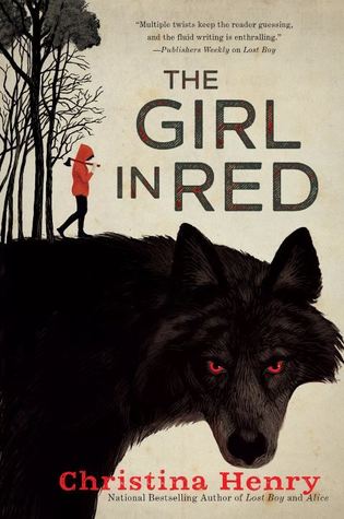
Fun post and a gorgeous selection of covers. I’m drawn to a lot of the same types of covers you are. I love bright, vibrant colors and surprising/unexpected elements. The Girl in Red is one of my recent favorites.
I agree that the cover for The Girl in Red is just stunning. Every time I see it, it makes me want to read that book. One of these days…
Ah this is such a fun post and I found myself nodding along to every one of your points here. I adore illustrated covers, they’re some of my favorite kind of book covers lately 😀
I don’t think I even realized how enamored I am with illustrated covers until I went to go find my favorites and found that every one I chose was illustrated!
The cover for Cinderella Is Dead is gorgeous! I’m so excited to read that book. I am such a sucker for illustrated covers!
I agree that the Cinderella Is Dead cover is stunning!
[…] reading Nicole at Feed Your Fiction Addiction’s What Draws Me To A Book Cover? post, I thought I to analyse my own tastes and list the types of covers that catch my […]
I think I did a similar post a while back; I also love illustrated covers and vivid colors! I think my favorite are covers with intricate details and contrasting colors, such as black and gold, black and red, red and white, etc 😀
Contrasting colors really draw the eye, I agree!