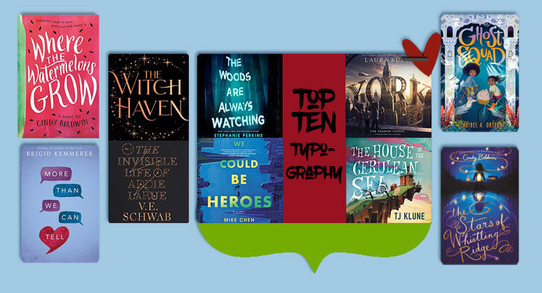
Top Ten Books with Stunning Typography
I chose five books I’ve read with covers that are pretty much all about the typography, and five where the incredible typography enhances an already cool image.

You can click on any of these titles to be taken to my review (in most cases – or Goodreads for the three I haven’t reviewed yet). You’ll also get to see an even bigger image of the cover! (I’ve credited the cover artists/designers if I could find them!)
1. Where the Watermelons Grow by Cindy Baldwin
Cover by Erin Fitzsimmons
This book definitely has a watermelon theme to it, but the cover is dominated by the title. This is a great cover for this heartwarming book about a girl dealing with her mother’s mental illness.
2. More Than We Can Tell by Brigid Kemmerer
This stylized title lets you know that a lot of the storyline will hinge on digital communication. (It makes the book a little more light and fluffy than it reads, though.)
3. The Witch Haven by Sasha Peyton Smith
Cover by Faceout Studio
This cover is essentially title-only, but it evokes a very witchy vibe just because of the typography and a circle of stars!
4. The Invisible Life of Addie LaRue by V.E. Schwab
This is one of my favorite title-only covers. I just love the font and the hint of celestialism. Plus, the book is utterly captivating!
5. The Woods Are Always Watching by Stephanie Perkins
Design by Anna Booth
You can tell at just a glance that this book is going to be creepy!
6. We Could Be Heroes by Mike Chen
Cover designed by Elita Sidiropoulou, with art direction from Gigi Lau
This book could almost seem like it’s all about the typography at first glance, but the sideways cityscape and the silhouette of two people hanging onto the title steal the show!
7. The Shadow Cipher by Laura Ruby
The actual title of this book is practically non-existent, but I LOVE how the series name YORK is spelled out in scaffolding! This really gives you the futuristic city feel of the book!
8. The House in the Cerulean Sea by TJ Klune
Cover art by Chris Sickels
I love how the title of this book winds in with the image, becoming part of it. This story is utterly wonderful and adorable, and I highly recommend it!
9. Ghost Squad by Claribel A. Ortega
Cover art by Lorena Alvarez Gómez, book design by Christopher Stengel
This is one where I love the entire cover (the adorable kids make me want to give them a giant hug), but the colors and whimsical font of the title are a main feature!
10. The Stars of Whistling Ridge by Cindy Baldwin
Illustration by Julie McLaughlin, with cover design by Cat San Juan and Erin Fitzsimmons
I just now realized that I used two Cindy Baldwin books for this list. Guess her typogropher should get a bonus! In this book, I would argue that the typography is so utterly gorgeous that it’s equally as important as the haunting silhouette figure in the background!
What covers with fabulous typography do you love? I wanna know!


Great examples! I especially love the YORK cover. It’s gorgeous. The book wasn’t bad either 🙂
Happy TTT (on a Wednesday)!
Susan
http://www.blogginboutbooks.com
I love the typography for The Witch Haven! So pretty.
Thanks for stopping by earlier.
I see that you’re a middle grade writer. I just finished maybe the first middle grade book I’ve read and absolutely loved it. I read When You Trap a Tiger and my review is going up next week. I recently read and enjoyed Here and Now and Then by Chen – the cover on this one is intriguing so I’ll check it out. Great list and thanks for visiting me.
Terrie @ Bookshelf Journeys
I obviously love the typography for The Witch Haven (since I also included it on my list), but The Stars of Whistling Ridge is stunning! Great list!
The YORK cover really jumped out at me!
The Woods Are Always Watching definitely has that creepy vibe! that would look good facing out on a bookshelf 🙂
I love the cover of Addie LaRue. It’s somehow both simple and eye-catching.
I really thought The Shadow Cipher was called YORK. LOL
You found some great examples!
OOoh nice picks! This topic was a little harder than I thought but I did enjoy it! Lol!
I am not going to pretend I read that much into the Kemmerer cover. Although, you are so right.
These are all so beautiful!! I especially like The Stars of Whistling Ridge.
Yes, I love the York cover, interesting though that it’s more visible than the title itself! Now I’m curious about this book
These are so fun! I love the way York looks–I still need to read that at some point.
But The Woods Are Always Watching and Where the Watermelons Grow are so cool, too. You chose a lot of great ones for this week’s prompt! 🙂
I love the cover for Where the Watermelons Grow. I bought that book just because I love Watermelon. hahaha. I still haven’t read it though. Great list!
Oooh, these are fun looking fonts for these covers! I do like the way they work with the rest of the cover.
Ghost Squad has such a fabulous cover. I love the colors so much. Great picks!
[…] TOP TEN BOOKS WITH STUNNING TYPOGRAPHY! […]
Where the Watermelons Grow has such an adorable cover! I think I may need to check out that book. I also agree on The House in the Cerulean Sea. That typography really captures the whimsical nature of the book.
I love this topic! Good typography can really make a difference on a cover. There are some covers I love for their artwork, but I do think to myself that it’s a bummer the title is in a plain font and really not even thought out where to put it, just plopped on. But like you shared here, even a title only cover can be gorgeous and convey vibes if it’s done well. These are beautiful! The York one has always been especially cool to me, though, yeah, I didn’t realize that wasn’t the title lol.